1. Gauge as panel
1.1 About a Gauge
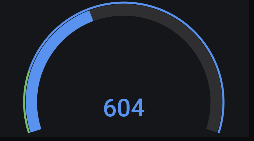
A gauge is a more advanced Stat panel, in which different threshold ranges can be visualized using colors.
It is similar to a Stat, by highlighting a key value using the same reduce operation possibilities a with the Stat.
However, in a Gauge the measurement values in the current time range can not be visualized in a background graph.
1.2 Setup a Gauge
Get into a dashboard panel.
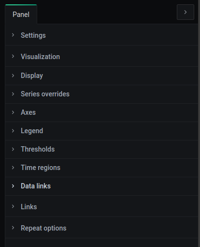
In the panel right pane, the panel can be configured.
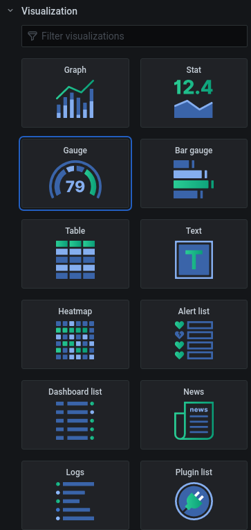
In the Panel visualization tab , the panel type can be selected as a Gauge by clicking the Stat.
2. Gauge display settings
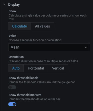
Click the Display dropdown in the right pane of the panel to open the display settings.
In the Gauge display settings some general settings can be applied, note that these display settings are quite similar to the Stat display settings .
2.1 Reduce to key value
For reducing the measurement values to one key value in a Gauge, this process and its options are identical to the Stat .
2.2 Layout
For the layout of the Gauge, two settings can be applied
Threshold labels
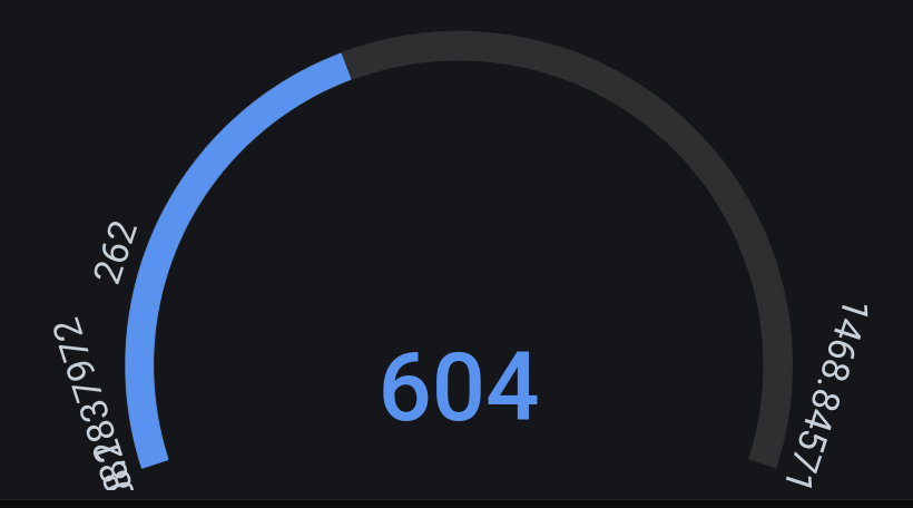
Threshold labels are the effective threshold values that could be displayed around the Gauge on the place where a thresholds is crossed.
Enable them by setting the Show threshold labels slider .
Threshold markers
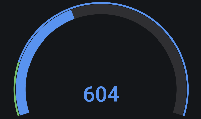
Threshold markers are the colored circular markers accompanied with a threshold value, which can also be displayed around the Gauge.
Enable these by setting the Show threshold markers slider .
3. Gauge configuration
Some basic settings for the Gauge can be altered by clicking the Field tab on the top right and unfolding the Standard options dropdown by clicking it.
These settings are identical to the settings of the Stat :
- Units
- Range
- Decimals
- Display name
- Empty key value
- Base color
- Thresholds