1. Panel as graph
1.1 About a graph
A Graph is the most frequently used panel visualization to view the queried data. This panel type also holds the most advanced customizations.
1.2 Setup a graph
Get into a dashboard panel.
In the panel right pane, the panel can be configured.
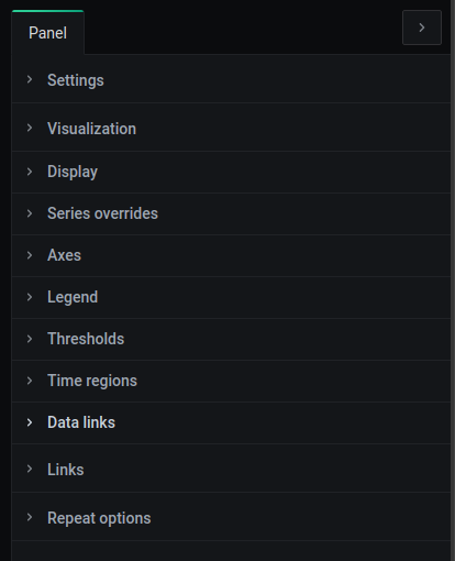
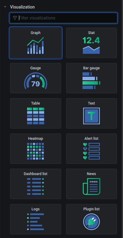
In the Panel visualization tab , the panel type can be selected as a graph by clicking the Graph.
2. View queried data in graph
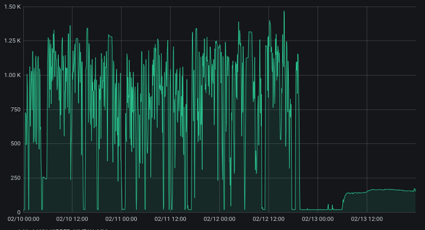
Get into a dashboard panel to view previously queried data on the upper left side in the panel.
By default a panel is of the Graph type, displaying the queried data in a graph-like manner.
- On the
x-axisthetimewill be displayed - On the
y-axisyourqueried datawill be displayed. The y-axisscalesby default between theminand themaxvalue of yourqueried datafor the available time range. This scale can be set onto fixed numbers in the graph configuration on the right side later on.
3. Graph display settings
Click the Display dropdown in the right pane of the panel to open the display settings.
In the Graph display settings, some general display properties can be changed.
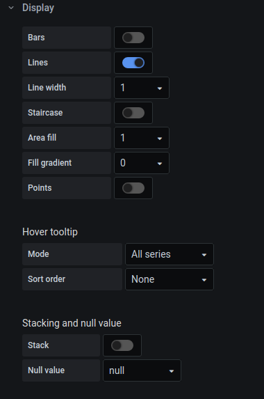
3.1 Connecting data points
There are 3 ways of connecting data points for a Graph in the panel display settings.
1) Lines
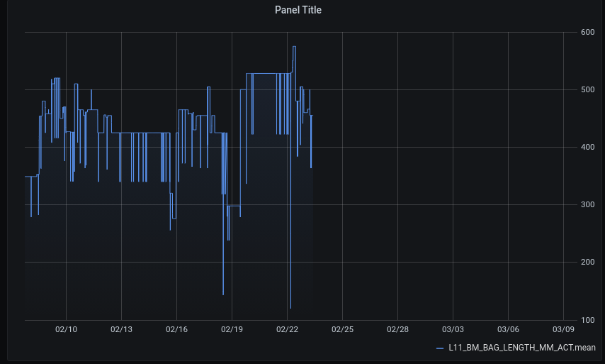
When enabling the Lines slider , data points will be connected with each other through lines. This is the default setting, which is useful for numeric data in general.
- You can set the width of the displayed line with the
Line width dropdown.
It could be that you need to remove the aggregator statement (f.e. mean) in the query editor and the group by statement to make the lines connecting the data points visible.
2) Staircase
A staircase can be set by enabling the Staircase slider .
A staircase does not connect data points directly with each other through a line, like the Lines do, but the staircase uses the previous data point’s value until a new data point is available.
This is great for boolean data, meaning they only have 2 possible outcomes like 1 or 0 , because the abrupt transition between values is shown. The staircase is characterized by the angular shape.
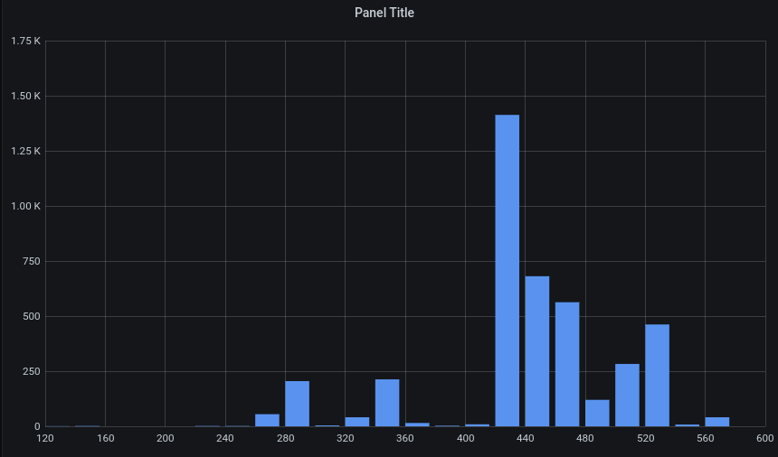
3) Bars
Bars can be enabled by enabling the Bar slider . Bars are interesting to compare aggregates of grouped data to each other.
For bars to become visible:
- use a
Group Bystatement in the query editor accompanied with aSelectoror anAggregator.
Explore measurements - query data
- Make sure the time period in the
Group Bystatement is large enough compared to thetime rangeselected for your dashboard, else the bars will be to small to be visible.
Bars can also be combined with Lines , which then will join the aggregates used for the bars. This is useful to get an overview of the changes between the Bar levels.
3.2 Fill area underneath graph
Further, a fill can be set on the Area underneath the graph and configured:
- The intensity of the fill can be set with the
Area fill dropdown. The higher the number, is the higher the fill intensity. - A gradient can be set with the
Fill gradient dropdown. The higher the number, the higher is the color gradient.
3.3 Raw data points
To view the raw data points, which were queried, enable the Points slider in the panel display settings.
This will show the points for which data was present if the time range is not set too big f.e. 1 year. If a Group by statement is used, don`t take a too small time period, else the points will dissolve in a line.
You can set the point radius by using the Point radius dropdown . The higher the number, the higher the point radius.
3.4 Graph display settings [multiple measurements]
The following panel display settings are only useful when multiple measurements are queried, each having their own query editor.
Panel tooltip on hover
For multiple measurements, the tooltip can display all measurement values for a given timestamp on hovering with the mouse over the query data. This can be done by setting Hover tooltip mode dropdown on All series .
Afterwards the measurements in the tooltip can be sorted by setting the Hover tooltip sort order dropdown to Increasing or Decreasing.
Stacking measurements
For multiple measurements, the measurement values can be stacked, meaning the values will be summed over different measurements per timestamp. This can be set by enabling the Stack slider .
For stacked values, the measurement value shown in the tooltip can be set to the individual values of the measurements by setting the Stacked value dropdown to individual. To see the summed value for the measurement on top, set the Stacked value dropdown on cumulative .
For stacked values, the y-axis can be changed to percentage based by enabling the Percent slider .
The values that are null can also be set as a zero in the Null value dropdown . By default null values are ignored and the preceding and the next value will be connected , which can also be selected in the Null value dropdown .
These dropdowns are only available when the Stack slider is enabled.
4. Graph series overrides
For a graph type, a Series override can be added. This gives the ability to override different layout properties for a single measurement (so called series) on the graph. This can be used when one or multiple measurements are queried and available in the graph.
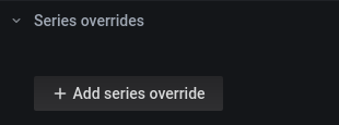
This enables high customization for a graph.
To set an override property, click the Add series override button and click the Alias or regex entry to look for available measurement that are on your graph. Select the measurement for which you want to set an override property. Then click the plus icon to add property for this measurement. You can set f.e. for a measurement to have Bars enabled by clicking Bars followed by clicking on true. Note that bars appear for only this measurement in your graph.
Multiple property overrides can be set on one measurement. Best way to explore, is to experiment yourself with the override properties.
5. Graph axes
In the panel axes settings, the settings for all graph axes can be configured. Click the Axes dropdown to unfold these settings.
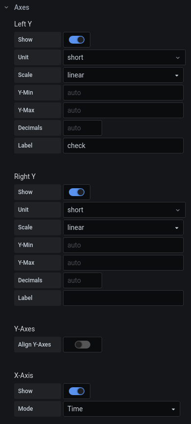
For each axis, with the Show slider , you can enable the axis to be show on the graph.
5.1 Left and right y-axis
Note that a left y-axis and a right y-axis exists for the graph. This is useful when having multiple measurements on the graph (and in the query editor), which have different units, to be able to show their values on a separate axis. This means that for one measurement, you can read it’s value on the y-axis on the left side of the graph, while for the other measurement, you can read it’s value on the right side of the graph.
To set a measurement on the right y-axis , first enable the show right y-axis slider . Afterwards click on the measurement symbol in the legend beneath the graph, which is here f.e. the short blue line next to the measurement name. Then a window pops up, click on the Y-Axis tab and enable the use right y-axis slider to use the right y-axis for the measurement selected.
When a measurement is set onto the right y-axis, the measurement will appear on the right in the legend!
5.2 Y-axis units
For both y-axes, you can set the according unit with the Unit dropdown in the Panel axes settings. You can click it, and start typing to search for a particular unit.
Short unit
Grafana can be displaying values in a short format, which is good practice for large numbers. F.e. 1 000 000 to be displayed as 1M, can be done by taking the short unit format after clicking Misc .
No unit
You can also deny a unit to be displayed by taking the none unit format after clicking Misc . This will also ensure that values do not get displayed in a short format. However, this is not guaranteed to display the raw data format, since decimals present in the raw data will not be displayed by default (see the decimals section below).
Custom unit
When a certain unit is non-existing in the current options, you can type a unit as you like to see it in the Unit dropdown and then click on the Custom unit: <your typed unit> label that appears. In this way you are able to set a custom unit on your Y-axis.
Note that when selecting a unit like ’m’ for meters, the SI prefixes will be automatically displayed, f.e. 1000 will be displayed as 1 ‘km’.
5.3 Y-axis scale
For both y-axes, the type of scale can be set with the Scale dropdown . In most cases a linear scale should be good to go. But if needed a logarithmic scale can be configured.
5.4 Y-axis range
For both y-axes, by default the range of the axis is scaled, so that the top of the y-axis resembles the max value of the measurements queried data points and the bottom of the y-axis resembles the min value of the measurements queried data. Thus, by default the queried data points are automatically scaled between the min and the max value.
In most cases, this is very useful, but sometimes you want to compare the queried data values to a fixed range f.e. when monitoring the fill height of a tank. Then you can set the bottom of the y-axis to the value you fill in Y-Min entry, The same applies for the top value of the Y-axis, which can be set by filling in the Y-Max entry .
5.5 Y-axis decimals
As indicated in the Y-axis units section, by default no decimals are shown, even if they are present in the queried raw data. You need to override the number of decimals to let them be displayed on your graph. This can be done by setting the number of decimals in the Decimals entry for a given Y-axis.
5.6 Y-axis label
You can give a label to be displayed next to the Y-axis, to make it more clear what is being displayed on this axis.
Type in the label in the Label entry to set this for a particular Y-axis.
5.7 Y-axes align
When measurements are on different Y-axes, you are able to align both axes on a particular level to get a more realistic overview of your graph.
By enabling the Align Y-Axes slider , the Y-axes get aligned on the value you fill into the Level entry.
By default the level is set to 0, meaning that both Y-axes will align so that their 0 value will be on the same horizontal line.
5.8 X-axis
There are different modes for the X-axis to be used:
1) Time
For the X-axis, by default the timestamps are shown on this axis.
2) Measurements
However, you can show the measurement name (series name) here, and get an aggregate of the queried data per measurement on the Y-axis. This can be done by setting the X-axis Mode dropdown to Series instead of Time and setting the X-axis Value dropdown to an aggregate of your choice.
This could be useful to get an overview of a certain aggregate per measurement, although the same aggregate can be calculated per measurement in the query editor as well, without using a Group By statement to get one resulting value.
3) Histogram
A Histogram of the queried data can be displayed by setting the X-axis Mode dropdown to Histogram.
In a Histogram the X-axis shows the values of the queried data, while the Y-axis shows the count of how many times a certain values occurs in the queried data.
A Histogram can be configured by setting the number of bins (here called Buckets), which are the number bags you take to collect the unique queried data values. The number of bins can be set by filling in the Buckets entry.
Next to that, a range for the queried unique data values can be set by filling in a minimum value in the X-min entry and filling in a maximum value in the X-max entry.
6. Graph legend
The legend of a graph can be configured.
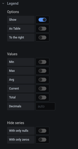
As with the Axes, the legend can be showed by enabling the Legend Show slider.
By default only the measurements names are displayed in the legend with their according symbol (f.e. short blue line).
6.1 Table legend with aggregates
The legend can be set as a table with a header, by enabling the Legend as table slider. Most of the time this is used in combination with displaying aggregates of the queried data in this table by enabling one of the aggregate sliders f.e. the Values Min slider.
Enable the desired aggregate slider to get them displayed. Fill in a number in the Value decimals Entry to get decimals being displayed in the legend table for the aggregates selected.
Confusing is the measurement named ‘Current’, which does not display the current value but the last value from the currently selected time range.
6.2 Legend positioning
The table can be positioned on the right of the graph, instead of at the bottom, by enabling the Legend to the right slider.
6.3 Hiding empty measurements
In the legend, there is the option to hide measurements (here called series), which only contain null values in the selected time range by enabling the Hide series with only nulls slider. Or one can hide the measurements, which hold only zero values in the current time range by enabling the Hide series with only zeros slider.
6.4 measurements color
Each measurement shown on the graph can be given a color by choice.
Click on the measurement symbol next to the measurement name, beneath the graph (same as for putting a measurements values on the right y-axis). Then a window pops up.
The Colors tab gives the ability to choose from a predefined set of colors.
The Custom tab gives the ability to choose a custom color, using the color picker or when filling in a hexadecimal code for a color in the Bottom entry.
For the hex colors, you can google a converter to get your hex color code . Easiest way is to find a converter that converts rgb(a) color codes to a hex color code , like this one:
For inexperienced users, the color picker is the most convenient way, although once a color is selected it is difficult to select the exact same color for another measurement afterwards. This is where the color codes come into play. The color picker is also reflected in the hex color code at the bottom, thus letting you copy the hex color code to use the color repeatedly.
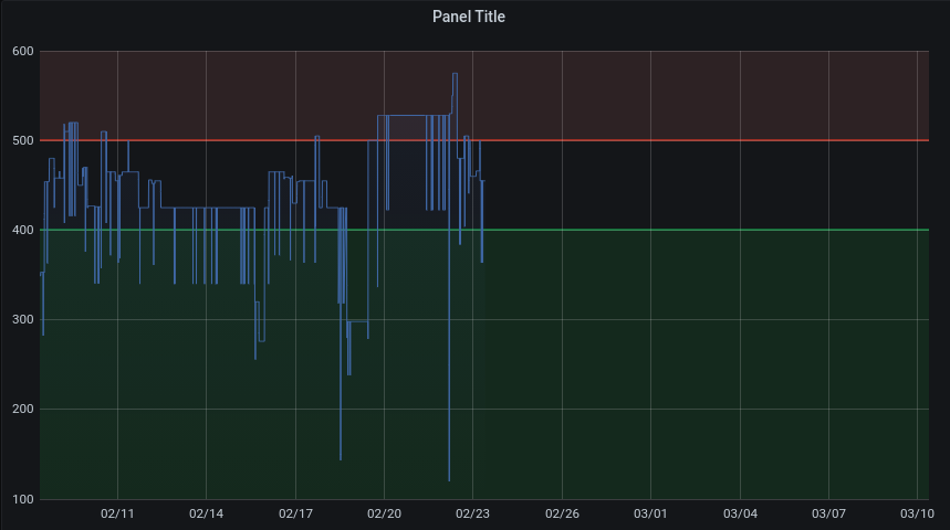
7. Graph thresholds
Thresholds can be set onto the graph, to indicate horizontal colored zones.
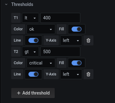
7.1 Default thresholds
These zones reflect some kind of status information about the measurement, depending on it’s value on the Y-axis. By default there are 3 predefined zones:
okfor when the value is init’s normal range, having agreencolor.warningfor when the value is just outside it’s normal range, but this isn’t critical yet, having anorangecolor.alarmfor when the value is in a critical state, outside the normal and warning range, having aredcolor.
You can add a threshold by clicking on the Add threshold button , then a threshold appears, labeled as T1 .
The threshold type can be set to lower then by clicking lt in the dropdown menu, greater than is set by clicking gt in the dropdown menu .
In the Entry field a threshold value can be set, here 400 or 500.
In the Color dropdown one of the above default statuses can be chosen.
Filling of the threshold zone can be done by enabling the Fill slider.
The Threshold line can be set by enabling the Line slider.
At last, the Y-axis where the threshold is can be set to left or right with the Y-Axis dropdwown .
Deleting thresholds rules, can be done by clicking the Waste bin icon next to the according alert rule.
Setting thresholds is NOT the same as setting alerts on your graph, which are discussed in a separate subpage. Thresholds are purely visual and no notification is coupled to the value of a measurement getting into a critical zone. To trigger notifications when a measurements value reaches a certain level, an alerts needs to be set on the panel.
7.2 Custom thresholds
Next to the default thresholds a custom threshold can be set, by clicking Custom in the Color dropdown.
Then an extra Fill color dropdown appears to set the color of the according zone on your graph, and an extra Line color dropdown appears in which you can set the color of the threshold line .
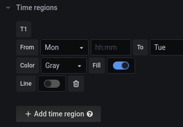
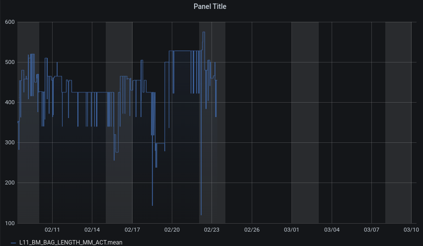
8. Graph time regions
With a panel time region, a custom time region can be displayed onto the graph.
This is useful to indicate f.e. a certain day to the viewer of the graph.
Add a Time region by clicking the Add time region button .
Indicate the Time region, by selecting the appropriate start day in the From dropdown .
A start time can be added by filling in the Entry next to this dropdown, with f.e. 12:00 for noon.
A stop day can be added by selecting the according stop day in the To dropdown .
The color of the time region can be set with the Color dropdown .
Filling this time region with the selected color can be done by enabling the Fill slider .
The lines of the time region can be highlighted by enabling the Line slider.
A time region can be deleted by clicking the waste bin icon .
9. Graph data links
Data links allow to add more granular context to the panel links, hence this is a more advanced topic.
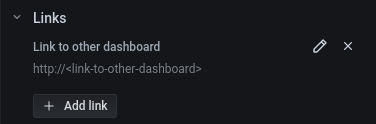
10. Graph links
There is an ability to add links to a panel. This is useful f.e. to add a link from the current panel to another related dashboard.
10.1 Add a link
Add a link by clicking the Add link button .
In the popup you need to specify:
- a
Titlefor your link, which is visible on mouse hover, by filling in theTitle entry. - a
URLfor your link, which is the link to be redirected to, by filling in theUrl entry.
You can choose to open the link on click in a new tab by enabling the Open in new tab slider.
10.2 Edit and remove a link
Added links can be edited by clicking the pen icon and can be deleted by clicking the cross icon .
10.3 View an added link
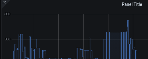
Added links can be accessed via the Outbound arrow icon on the top left of a panel. This will be visible once a link is added to the panel.
11. Graph repeat options
A panel can be used as a panel template to make more panels of the same in a dashboard. To do this, you need to have a dashboard variable setup in your dashboard settings, so that the panel can be repeated for each value of the dashboard variable.
Once you have a dashboard variable, click the Repeat options dropdown and select the dashboard variable to use. Don’t forget to apply your settings, afterwards the panel will be repeated for each value present in the dashboard variable selected.